🗃️Issue #54 Lead gen ad
IN TODAY’S EDITION
1⃣ Compact umbrella ad
2⃣ Lead gen ad
3⃣ Snack bar ad
Hi Marketer. In this issue, we'll look at an ad that raised $185,000 on Kickstarter, a lead generation ad featuring twin brothers that grabs your attention, and an AI-created ad about snack bars.
Let’s get into them below.

🤝TOGETHER WITH DIGITAL AD SNACK
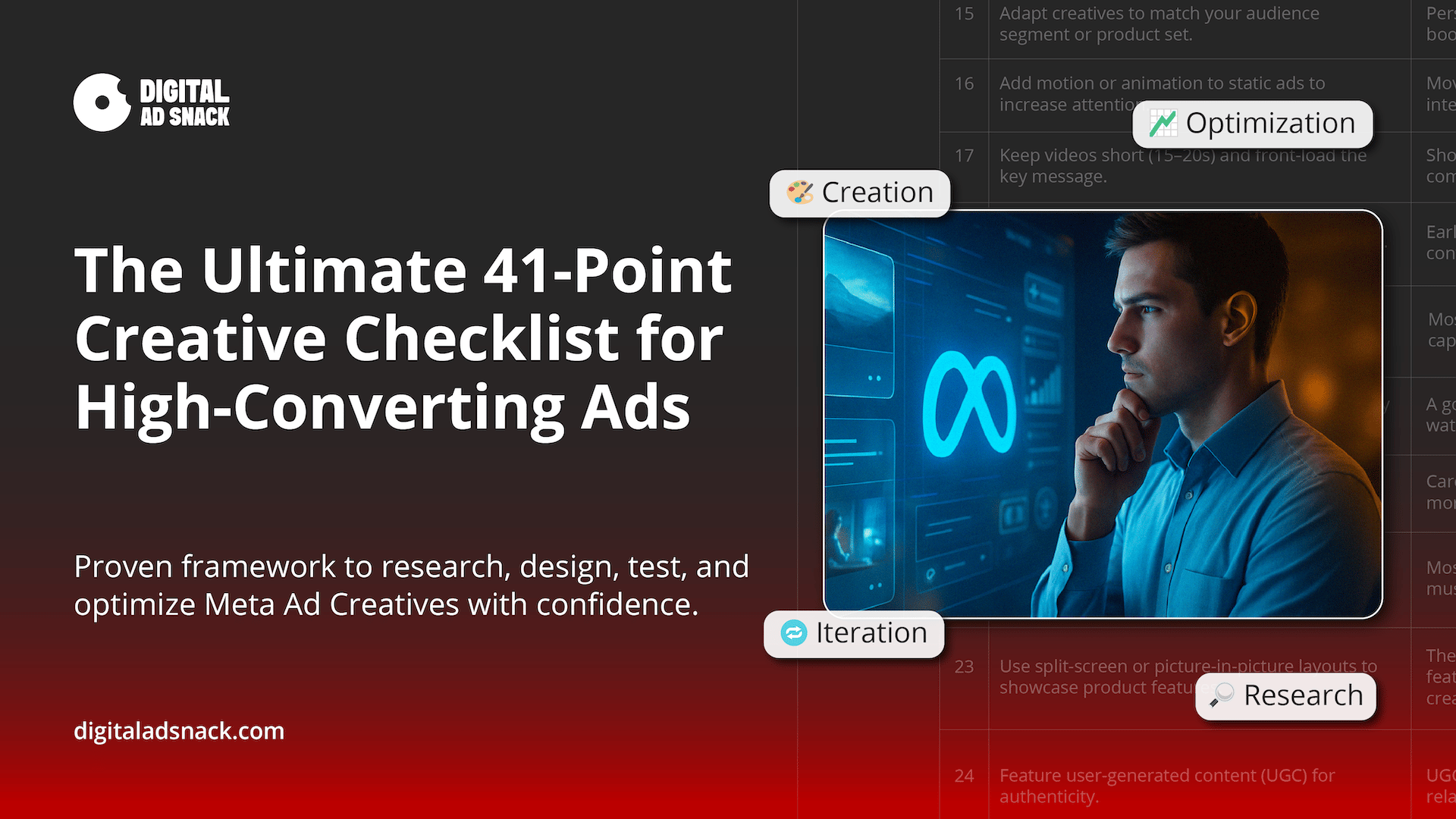
Never Doubt Your Ad Creative Again
Struggling to make your Meta Ads stand out?
You’re not alone.
The difference between an ad that gets scrolled past and one that actually converts is in the details.
That’s why I put together this 41-Point Creative Checklist—a step-by-step guide to help you:
• ✅Learn to research ad creative ideas
• ✅Design scroll-stopping creatives that grab attention instantly
• ✅Write smarter copy that connects with your audience
• ✅Test and optimize ads for long-term profitability
Whether you’re running your first campaign or scaling an existing account, this checklist gives you a repeatable system for winning creatives.
Don’t guess.
Don’t copy competitors.
Use the checklist the pros rely on.

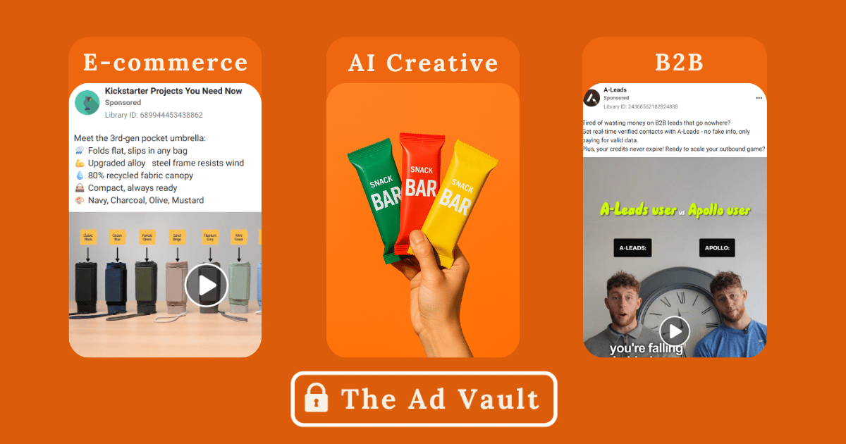
📦E-COMMERCE
Compact umbrella ad
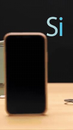
If you want to see the full ad for Simprella, you can look it up here.
Active: 31 days
This product raised $185,000 on Kickstarter and still has 31 days to go.
The initial five seconds of the ad grabbed my attention with its stop motion style.
As the user opened the compact umbrella, the ad seamlessly transitioned into a vibrant lifestyle piece set against an urban backdrop.
It's an engaging visual experience, reminiscent of the iconic Apple iPod ads with their colourful flair.
You can achieve a similar effect by filming a scene, subtly moving your product to give it a lifelike quality, and then editing it with Capcut.

🗄B2B
Lead gen ad
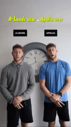
If you want to see the full ad for A-Leads, you can look it up here.
Active: 36 days
This ad stood out as the highlight of this week's issue.
I've seen numerous 'before and after' or comparison ads from competitors, but this one truly elevated those principles to a new level.
The ad uses a subtle strategy to outshine the competition by comparing features and prices, showcasing how their product excels in cost-effectiveness or doing one feature MUCH better.
The information is clear, and for some reason using twins as a visual element makes it interesting and attention-grabbing.

🤖ChatGPT Ad Creative
Snack bar bad
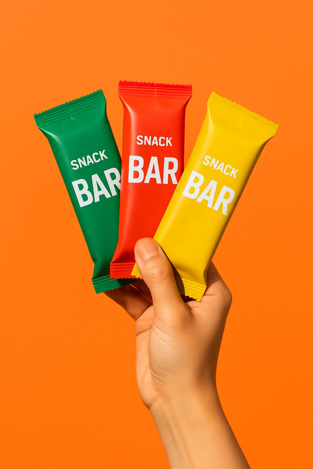
🤖Prompt:
A minimal, bold studio shot of a hand holding three packaged snack bars against a solid, brightly colored background vivid orange or a bold pastel. The hand is positioned in the center of the frame, gripping the bars so that each package is clearly visible and angled outward. The product packaging should pop with vibrant colors and clean branding. Lighting is sharp, even, and slightly dramatic to enhance contrast, with no shadows on the background. The overall look is modern, playful, and eye-catching, emphasizing both the hand and the product without any distractions.
Are you looking to get in front of 2,000+ marketers? Sponsor this newsletter.
MY RECOMMENDED TOOLS:
-
Get 10 free downloads with CreativeAI to produce ads
-
This is my favourite platform for building marketing quizzes
-
Ads Audit Report - to help you audit your META ads
-
Customer LTD template - my go-to spreadsheet to calculate my client's life-time-value
-
META Ad Library - my go-to research place to find META ads
-
My #1 email marketing tool that saved me months of work
-
Struggle to create ads? Get access to the 🗃️Ad Library
*Clicking partners’ links may generate a fee that supports the newsletter team
THIS WEEK’S MEME:

Explore awesome newsletters👇
THAT’S A WRAP
And, that’s it from The Ad Vault…Thanks for reading this week’s issue. I hope this inspired you to make 1% better ads than you would before.
See ya next week!